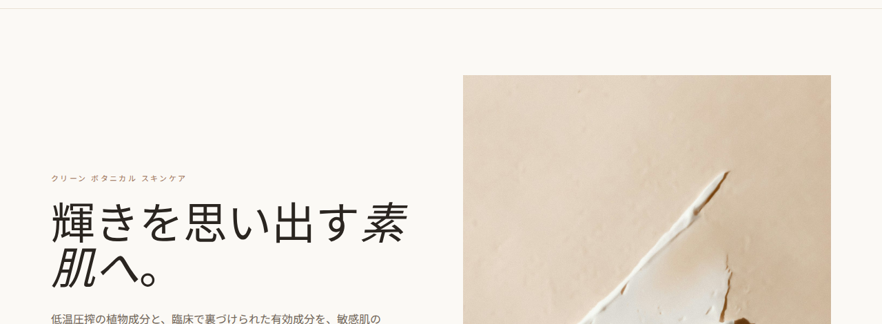
Original (English)
The English site — clean, considered, built for a Western audience.
View the live page →
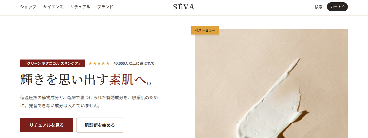
Just translated
Japanese text poured into the same design. The type is inherited (not set for Japanese), and the layout offers none of the density or social-proof cues Japanese buyers expect. This is what “just translate it” actually ships.
View the live page →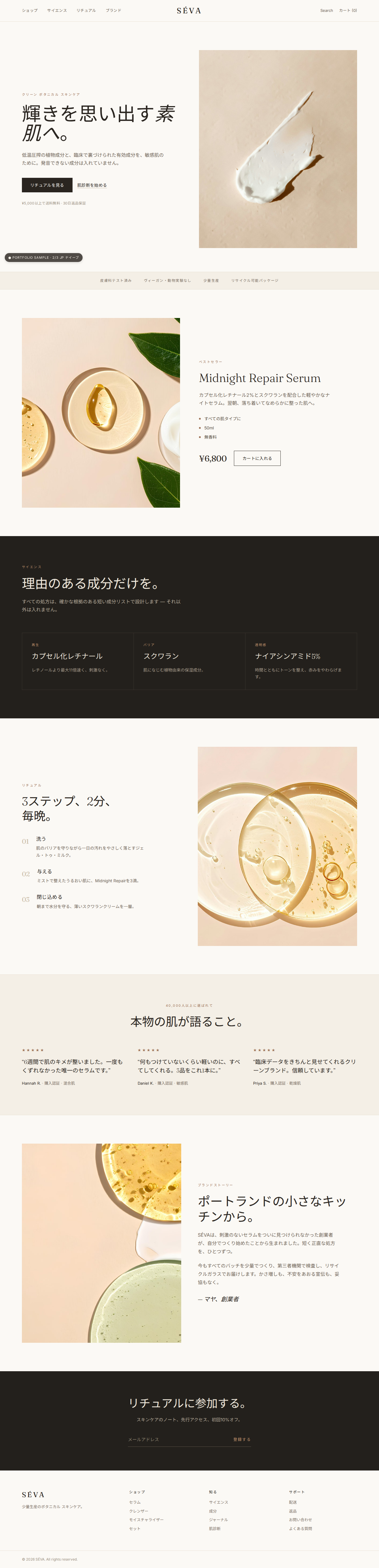
Localized
Rebuilt to Japanese conventions — same content, native structure: a denser rhythm, ★ ratings and trust up front, a Mincho/Gothic pairing set for Japanese.
View the live page →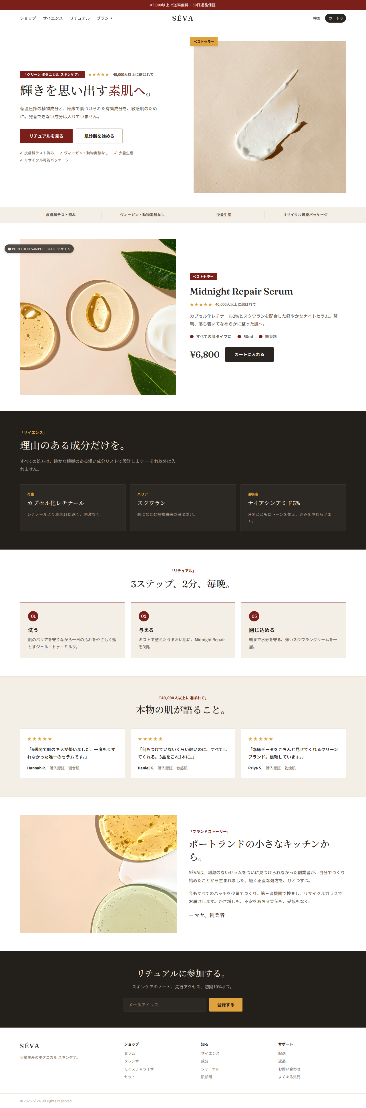
Scroll each panel, or click to open full size.