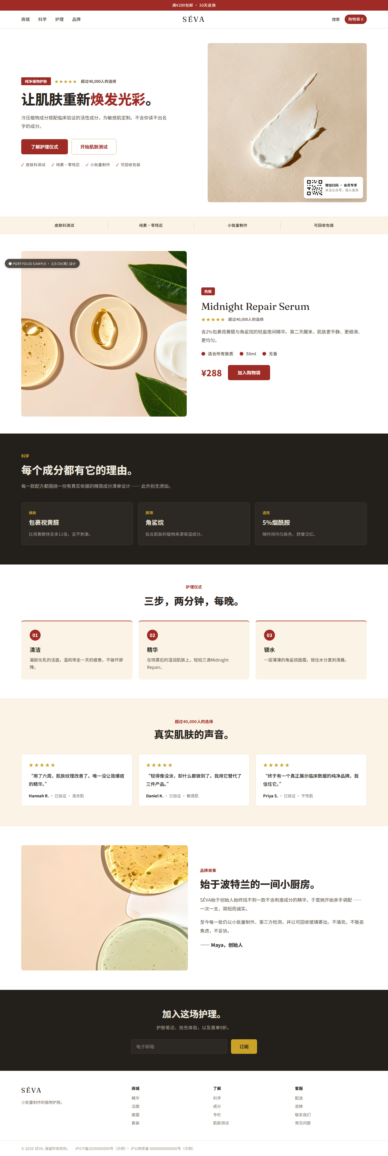
简体中文
Mainland China
Density, red/gold accents, ★ ratings, WeChat QR, ICP footer — type set in Noto Sans SC.
See the before / after →
繁體中文
Taiwan · Hong Kong
Traditional Chinese conventions and trust cues — a distinct market, not a font swap.
See the before / after →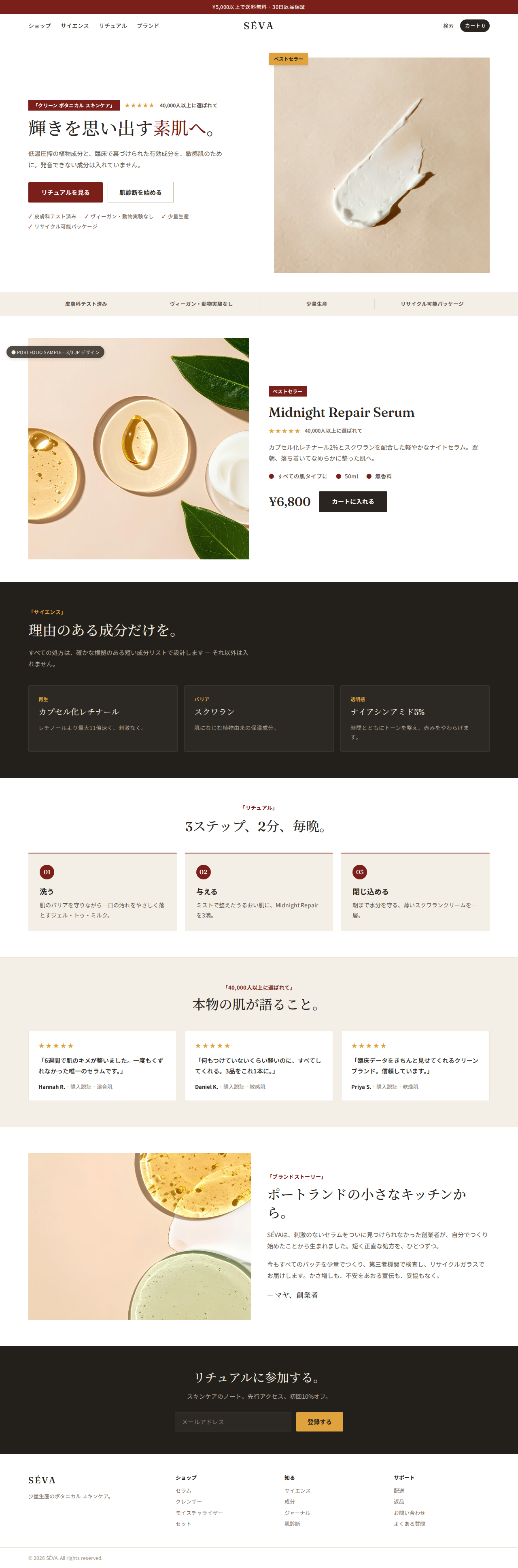
日本語
Japan
A denser rhythm, ★ ratings and trust up front, a Mincho/Gothic pairing set for Japanese.
See the before / after →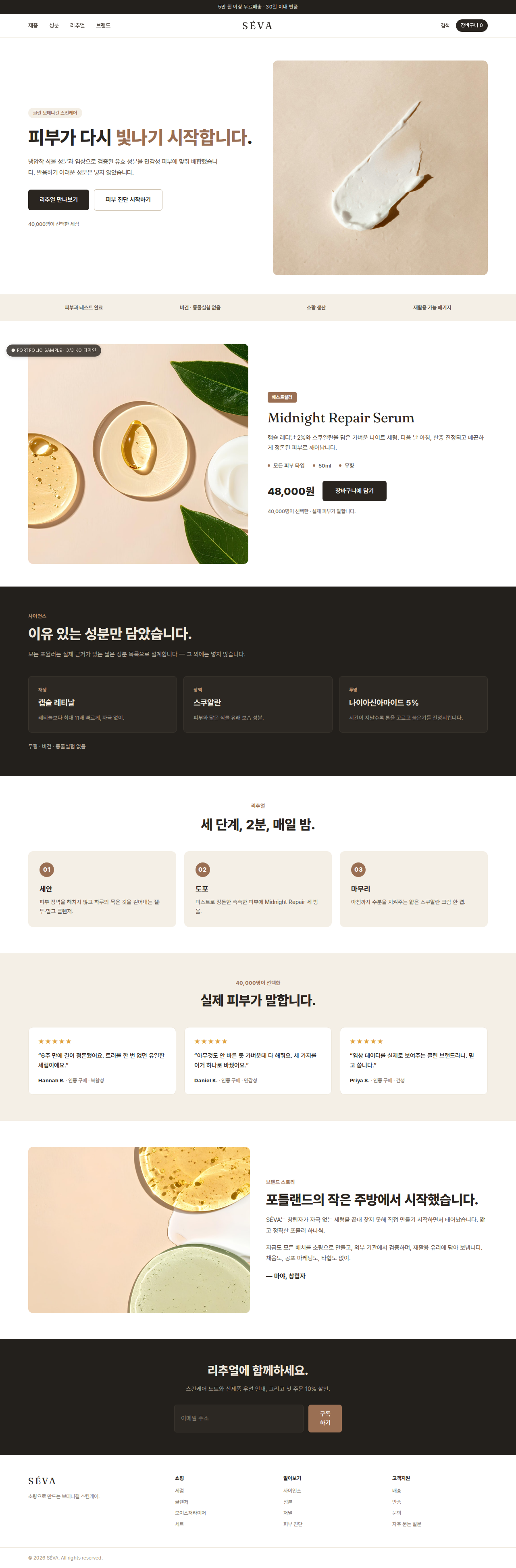
한국어
Korea
Trust up front, a denser rhythm, decisive calls to action — type set for Korean.
See the before / after →Same English original across all markets — view the original.